Beta Diversity and PCoA
There are many different options when it comes to beta diversity analayis and plot ordination. The phyloseq documentation is a good place to start to understand the different types of analysis. You can also use the help function in r ?ordinate and ?plot_ordination.
The operation of the plot_ordination function also depends a lot on the: Distance and Ordinate functions.
The subset_ord_plot function is a “convenience function” intended to make it easier to retrieve a plot-derived data.frame with a subset of points according to a threshold and method. The meaning of the threshold depends upon the method. Phyloseq examples are avilable here.
In this workflow we will use the plot ordinate feature to determine what variables affect the diversity of the tick microbiome.
MDS on Bray Distances
ord_MDS <- ordinate(samples_only, "MDS", "bray")
p <- plot_ordination(samples_only, ord_MDS, type = "samples", color = "Genus_Species", shape = "Tick_Instar", title = "MDS ordination") + geom_point(size = 1)
print(p)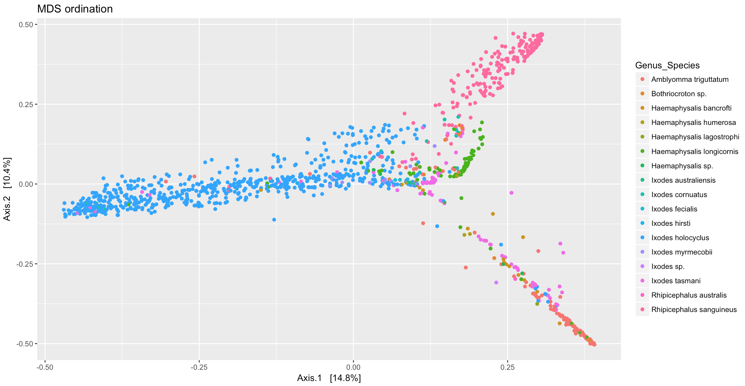
To facet the figure by a variable use ggplot command facet_wrap
p + facet_wrap(~Genus_Species)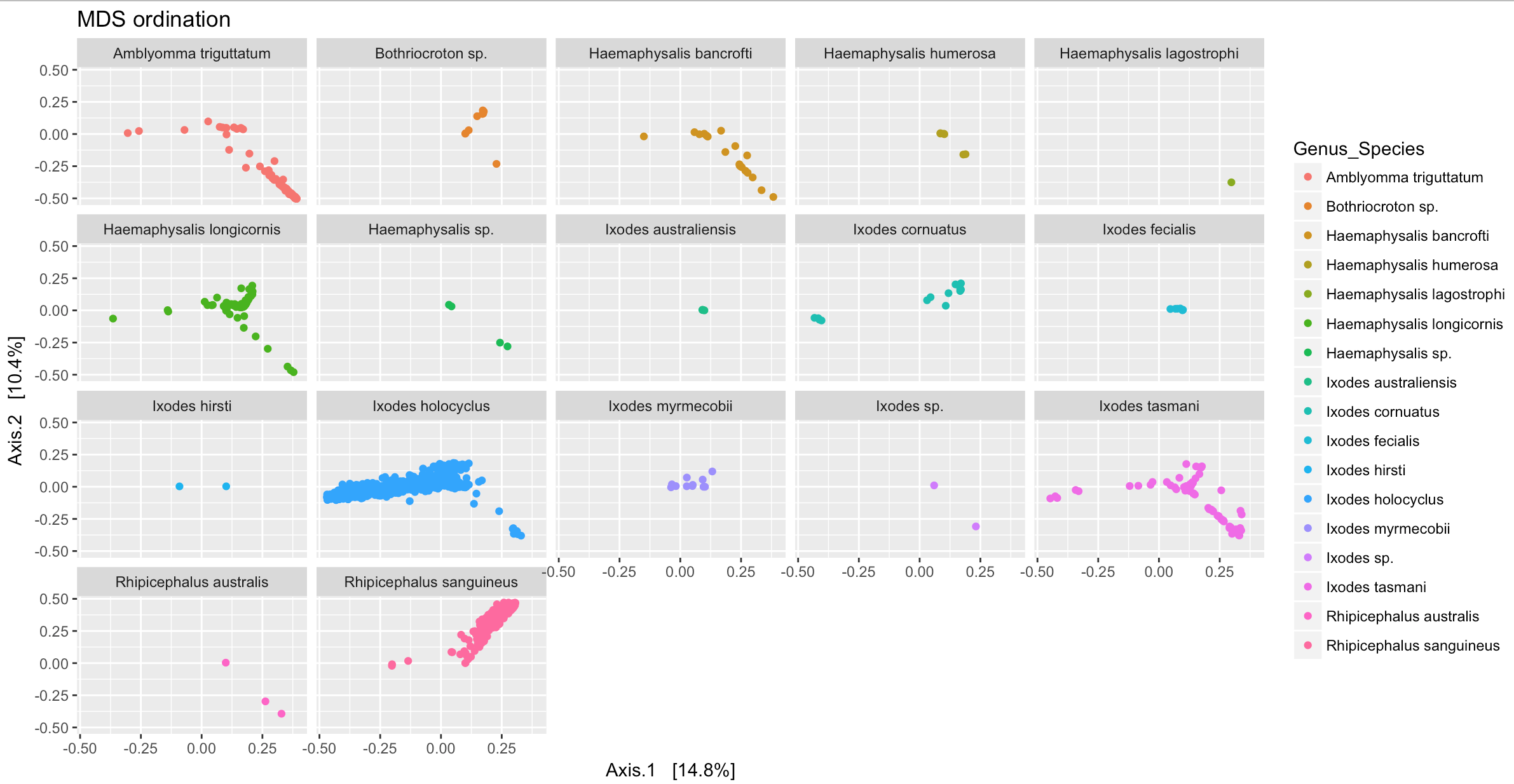
Another way that is useful to group samples is to use ggplot geom_polygon feature, however this is best used when there are only a few samples to plot and all samples of the same variable group closely together.
p2 <- plot_ordination(samples_only, ord_MDS, type="samples", color="Genus_Species")
p2 + geom_polygon(aes(fill=Genus_Species)) + geom_point(size=1) + ggtitle("Genus_Species")
MDS (“PCoA”) on Unifrac Distances
Use the ordinate function to simultaneously perform weightd UniFrac and then perform a Principal Coordinate Analysis on that distance matrix (first line). Next pass that data and the ordination results to plot_ordination to create the ggplot2 output graphic with default ggplot2 settings.
The first line of code to ordinate the data can take a long time for large datasets
ord_PCoA_unifrac = ordinate(samples_only, "PCoA", "unifrac", weighted=TRUE)
plot_ordination(samples_only, ordu, color="Genus_Species", shape="Tick_Instar")
Heatmap of ordination
We can also present the ordination methods as a heat map. This works best for smaller datasets so we will subset the large physeq1 data to only Ixodes tasmani
tasmani <- subset_samples(physeq1, Tick_Species== "tasmani")plot_heatmap(tasmani, "NMDS", "jaccard")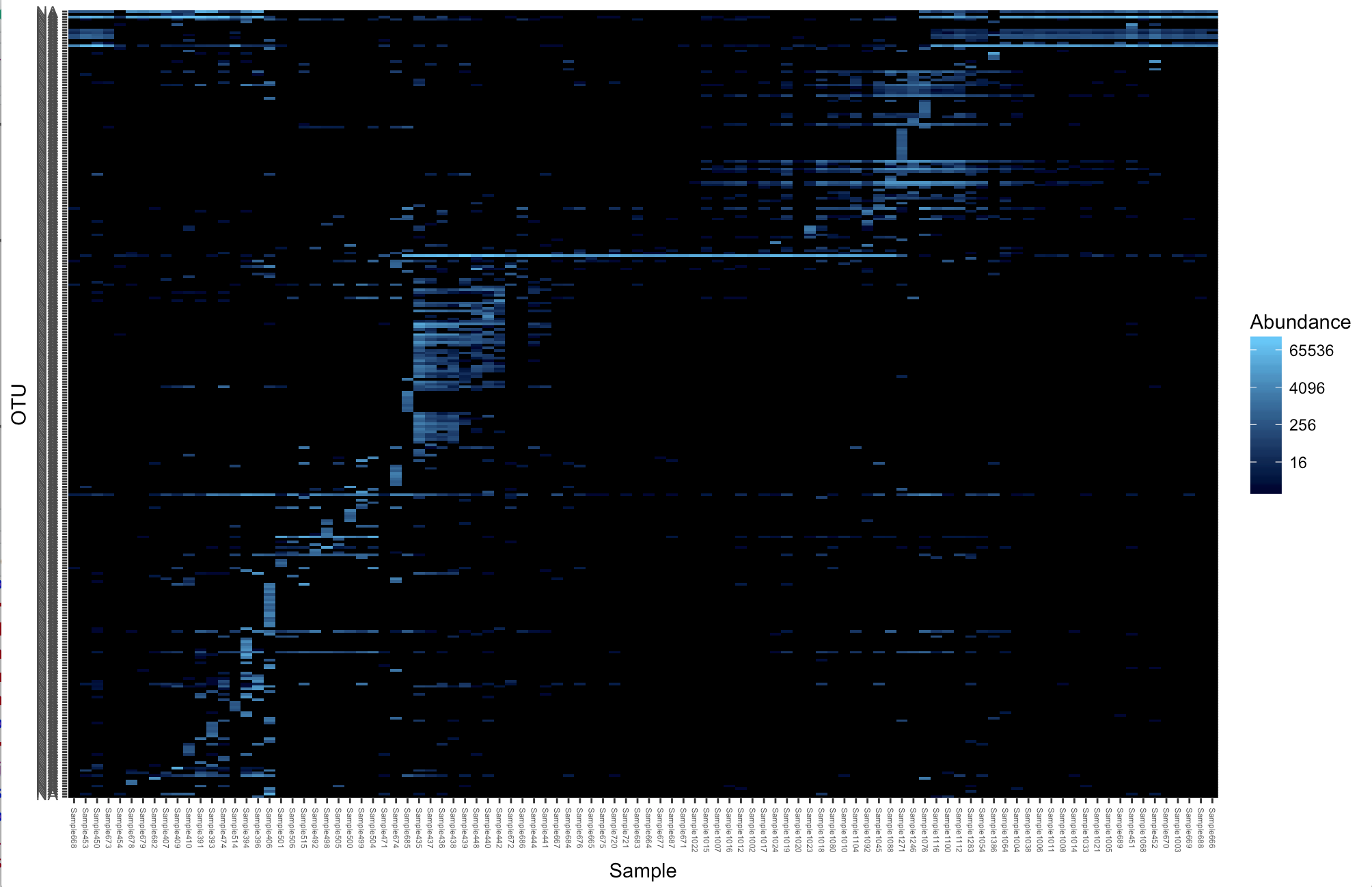
plot_heatmap(tasmani, "DCA", "none", "Host_common", "Family")
Vector and Waterborne Pathogens Research Group. 2018. S Egan.